Colors
Colors can be defined using HSV, HSB, or hexadecimal notation. For greater flexibility, you can also use Colorscheme.Colors, which adapt their color tones based on the user’s settings.
<Resources>

  <!-- colors -->

  <Color name="ColorA" color="red"/><!-- standard colors (red, green, blue, yellow etc.) - use for prototyping purposese only -->
  <Color name="ColorB" color="#123456"/> <!-- hex -->
  <Color name="ColorB2" color="#123456ab"/> <!-- hex alpha -->
  <Color name="ColorC" color="hsl(120,100,50)"/>  <!-- hue [0-360], saturation [0-100], luminance [0-100] -->
  <Color name="ColorC2" color="hsl(120,100,50,10)"/>  <!-- hue [0-360], saturation [0-100], luminance [0-100], alpha [0-100] -->
  <Color name="ColorD" color="hsv(120,100,50)"/> <!-- hue [0-360], saturation [0-100], value [0-100] -->
  <Color name="ColorD2" color="hsv(120,100,50,10)"/> <!-- hue [0-360], saturation [0-100], value [0-100], alpha [0-100] -->

  <ColorScheme name="Main"><!-- ColorScheme.Color dependent on "Main" ColorScheme settings -->
    <ColorScheme.Color name="ColorE" color="hsl(212,100,50)"/>
    <ColorScheme.Color name="ColorF" color="hsl(212,100,50)" luminance="10:20" invertedColor="hsl(190,100,40)"/>
  </ColorScheme>

</Resources>
The neutraldesign package defines multiple ColorScheme.Colors that are useful for accompanying custom styles and shape definitions: For example, “@Main.LabelColor” (commonly used as the default text color for many controls) should also be considered the preferred “textcolor” in custom styles, as it automatically supports color inversion. You can find a list of these common ColorScheme.Colors in the sharedcolors.xml file inside the neutraldesign skin package.
@Main.LabelColor                - Default color for static text
@Main.LabelColor.Secondary      - Secondary color for static text
@Main.IconColor                 - Default color for icons on buttons
@Main.HighlightColor            - Primary highlight color
@Main.WindowBackgroundColor     - Window backcolor
Color Scheme
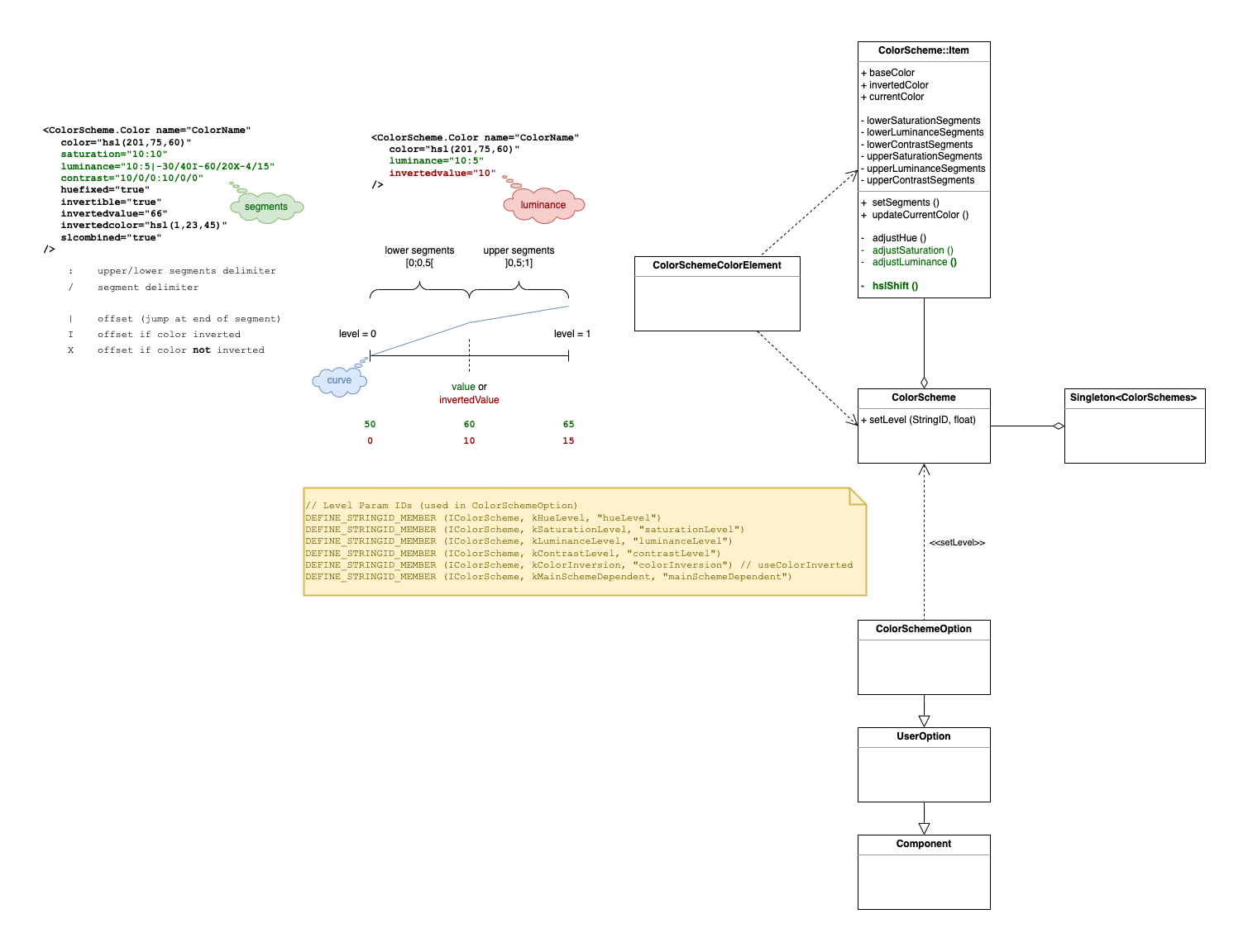
A <ColorScheme.Color> supports color inversion, changes to hue, saturation and luminance, depending on the user settings in the app’s color scheme options.
Skin Attributes
- color:
defines base color
- huefixed:
keeps the base color’s hue value as is when color scheme option hue level changed
- invertible:
[default: true] defines whether a color is affected by color inversion (e.g. set to false if you don’t want it to automatically invert)
- invertedcolor:
defines specific color when inverted
- invertedvalue:
overrides luminance value of base and inverted color when inverted
- saturation:
defines how saturation value is affected when color scheme options are changed (value or curve)
- luminance:
defines how luminance value is affected when color scheme options are changed (value or curve)
- contrast:
defines how contrast values are affected when color scheme options are changed (value or curve)
- slcombined:
increases the saturation with increasing luminance (deprecated)
Value Curves
A value curve is linear in general. Each curve can define segments with different slopes.
there are 2 sections separated by a
:- lower segments : upper segmentssegments are separated by
/the value that is added to the base color value at the “end” of a segment is defined by the segment value divided by the number of segments in this section
segments are uniformly spread over a section
lower segments’ end is at min - upper segments’ end is at max
a segment can define a jump offset at its end:
|always appliedIapplied when colorInversion is setXapplied when colorInversion is not set